Understanding Bitcoin Price Charts
Technical analysis is an important aspect of successfully trading Bitcoin and other cryptocurrencies. Price charts are at the heart of all technical analysis. Understanding Bitcoin price charts can seem intimidating to the inexperienced trader. All of that data and the graphs themselves can be overwhelming. Cryptoswede has put together a guide that will help you make sense of these important tools.
A Primer on Bitcoin Price Charts
Perhaps you already own some Bitcoin. Maybe you are thinking about getting some in the future. Either way, you will always want to know what your Bitcoin is worth. The value of Bitcoin is not like the value of a fiat currency. One US dollar will always have a value of $1.00, but one Bitcoin may be worth $15,000 or $6,000 or $100 on any given day. This is because the value of cryptocurrencies are expressed in terms of the USD, EUR, or other traditional currencies.
This does not mean that Bitcoin is pegged to these forms of physical money. It’s value depends on many factors, but none of these are directly related money that is issued by a government. Tracking the value of Bitcoin demands that you stay informed on the crypto markets. Just like any other financial market, it is sometimes possible for smart investors to predict market movements. This is where Bitcoin price charts come in handy.
What is a Bitcoin Price Chart?
First, let’s define what a Bitcoin price chart is. In very simple terms, a price chart for Bitcoin is a graph that displays the value of the digital token over a specific period of time. There are price charts that show the value for a year, a month, a week, and even a day. Some day traders may even access charts that show the value of Bitcoin and how it has fluctuated within the last hour.
Here is an example of a simple Bitcoin price chart:
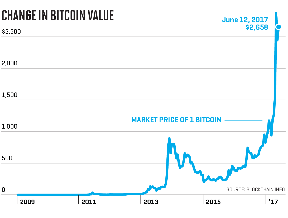
This chart is a rudimentary example of the information that a price chart needs to convey. It is also an example of what one should be able to see in terms of a graph. So, let’s break down the important aspects of this simple chart:
- At the bottom of the chart is a range of time, from Bitcoin’s introduction in 2009 until mid 2017.
- On the left side of the chart there are USD valuations in increments of $500.
- In the middle of the chart is a graph which represents the value of Bitcoin in USD for the given time period of the chart.
These are the three common characteristics that all Bitcoin price charts will share. Time, value, and the change of value over time. Simple, right? Truly, you don’t need to be a rocket scientist in order to learn how to read basic Bitcoin price charts. Of course, some charts are more detailed and sophisticated than others. Advanced charts may require more experienced interpretation.
Forecasting the Future Price of Bitcoin
The fictional investor Gordon Gekko once said that speculation is the mother of all evil. Speculation is what investors do. They study the past movements of the market in order to determine which direction the market will move in the future. Successful investments are made when one can make an accurate projection of the market.
Think about this. If you had known the value of Bitcoin would soar when it was first introduced in 2009, would you have bought up some of the tokens? Of course. There are probably smart investors that have made many millions from Bitcoin. By the same token, there are individuals who have lost money by buying Bitcoin at the wrong time. It’s all about speculation.
Traders have learned to identify trends in price charts for securities. They are able to spot patterns in graphs that may indicate whether the price of the security will rise or fall. When these patterns are spotted the Bitcoin trader has two options. They can buy the coin, or go long. They can sell the token, or go short. In both scenarios it is possible for the investor to make money.
No one has a crystal ball when it comes to the value of traded securities like Bitcoin. Even the Oracle of Omaha, Warren Buffet, is not right all the time. But price charts can give you the advantage of making an educated guess when it comes to value speculation.
Where to Find Bitcoin Price Charts
There are a large number of websites that provide historical Bitcoin price data for free. You can certainly watch the price movements of Bitcoin on Cryptoswede. There are also paid services that provide charts for a fee. We would advise you to steer clear of these unless you are a skilled investor.
For the beginner, the best source of price charts will typically be a cryptocurrency exchange. When you open an exchange account you will be given access to price charts and other trading tools like the SMA, Bollinger Bands, and MACD. These tools work together with price charts to give a more accurate picture of Bitcoin’s value.
Exchanges will provide price charts for free, so that is a definite advantage. You should investigate what kind of charts an exchange provides before you make a decision to open an account. Never register with an exchange that does not provide accurate pricing data.
The Candlestick Price Chart
By far the most popular type of price chart is the candlestick. This chart is sometimes referred to as a Japanese candlestick chart. It combines elements of a bar chart and a line chart. Here is an example of a Bitcoin candlestick chart:
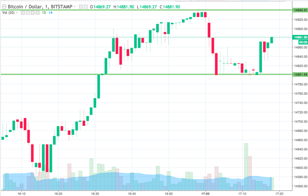
A candlestick chart improves upon a traditional chart by displaying four important pieces of information in a single graph:
- The opening price
- The closing price
- The high price
- The low price
Just like other charts, candlesticks can be defined to cover a precise period of time. There are charts for one year, one day, one week, and one hour. Some candlestick charts used by day traders even cover the period of 15 minutes! Looking at this chart will give you a complete picture of Bitcoin’s value for the given time period.
In the sample chart above you will notice that each candlestick is composed of a body and a wick. A green body indicates a bullish or positive trend. A red body indicates a bearish or negative trend. The top of the body represents the opening price for the defined time period. The bottom of the body indicates the closing price. The top of the wick represents the high price during the period, while the bottom wick indicates the lowest price at which Bitcoin traded during a specific time frame.
Why is this important? Looking at the fluctuation of the candlestick on a given day or week can be an indicator of volatility in the marketplace. This can sometimes be useful in helping investors determine market signals and set up profitable trades.
What You Should Do Now
Now that you have some type of idea regarding Bitcoin price charts and how to read them, the next step for you is to assemble your own set of charts for study and reflection. You will want to keep these on your computer or in a binder for easy reference. There is no substitute for knowledge when it comes to cryptocurrency trading.
A word of caution. Do not rush into trading securities until you are ready to do so. Impatience is the cause of losing money for many investors. The market isn’t going anywhere, and there will always be good buying and selling opportunities. Take your time, do your homework, and profit from your speculation.